
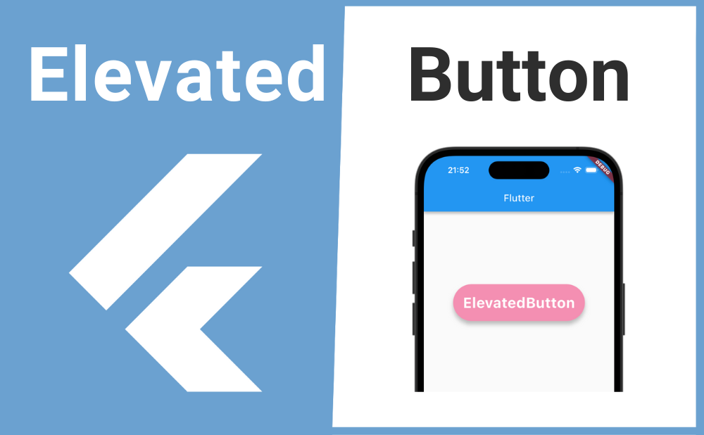
「影のある立体的なボタンを表示したい」
こんな時に便利なのが ElevatedButton ウィジェットです。
ElevatedButtonを使用することで影のある立体的なボタンを実装できます。またElevatedButton.styleFromウィジェットを使えばボタンの背景色や形、影の高さなど様々な装飾ができます。
それではElevatedButtonの基本的な使い方とカスタマイズ方法について解説していきます!
基本的な使い方
ElevatedButtonの基本的な使い方について解説します。
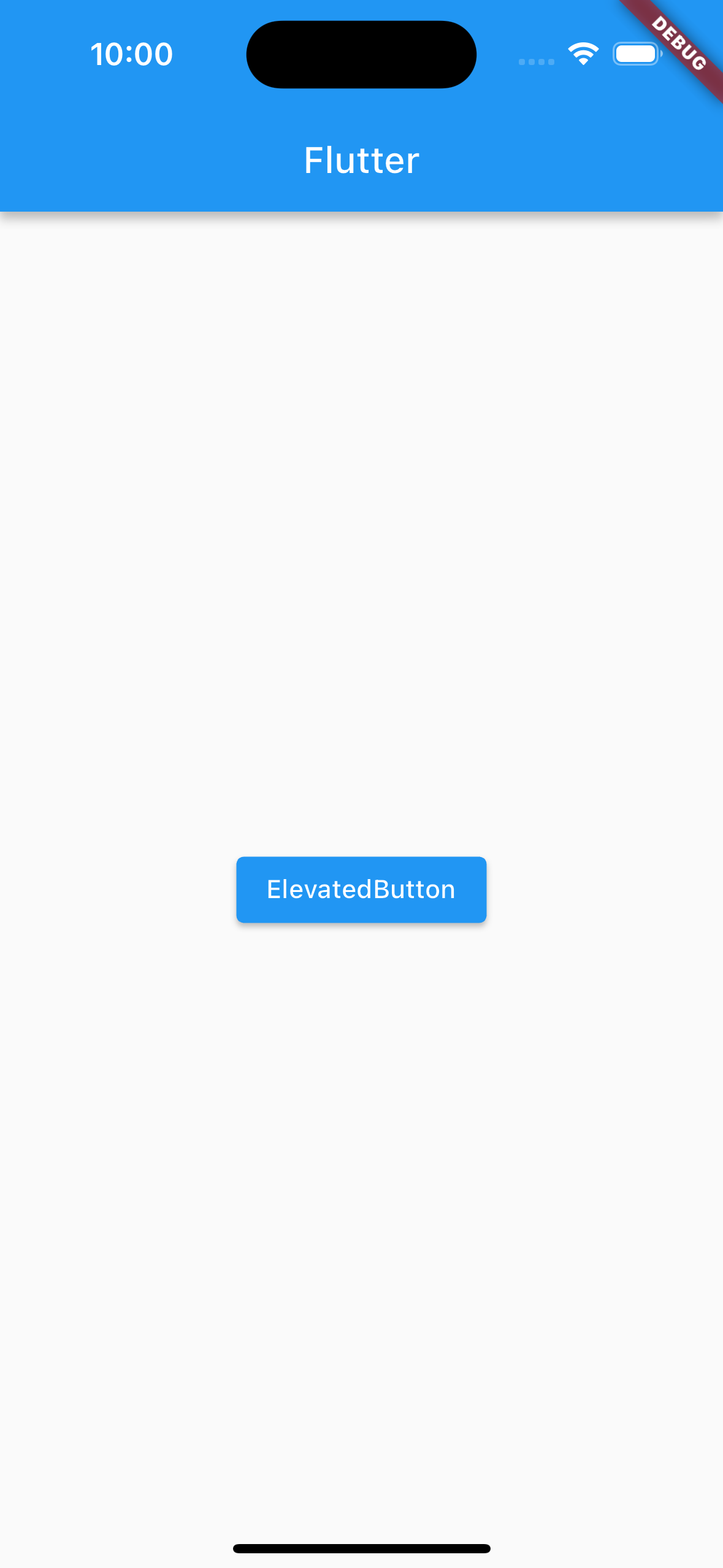
ElevatedButtonを実装するにはchildプロパティの引数にボタン上で表示されるウィジェットを渡し、onPressedプロパティの引数には無名関数を渡しボタンが押された時の処理を書きます。
ElevatedButton(
  child: Text('ElevatedButton'),
  onPressed: () {
    //ボタンが押された時の処理
  },
),
画像のサンプルコード
import 'package:flutter/material.dart';

void main() => runApp(const MyApp());

class MyApp extends StatelessWidget {
  const MyApp({super.key});

  @override
  Widget build(BuildContext context) {
    return const MaterialApp(
      home: MyWidget(),
    );
  }
}

class MyWidget extends StatelessWidget {
  const MyWidget({super.key});

  @override
  Widget build(BuildContext context) {
    return Scaffold(
      appBar: AppBar(title: const Text('Flutter')),
      body: Center(
        child: ElevatedButton(
          child: Text('ElevatedButton'),
          onPressed: () {
            print('ボタンがクリックされました');
          },
        ),
      ),
    );
  }
}
カスタマイズ方法
続いてElevatedButtonのカスタマイズ方法について解説します。
ElevatedButtonの基本的な装飾はstyleプロパティの引数にElevatedButton.styleFromウィジェットを渡して設定できます。
ElevatedButton(
  child: Text('ElevatedButton'),
  onPressed: () {},
  style: ElevatedButton.styleFrom(
    // ここで様々な装飾ができる
  ),
),
影の高さ
ボタンの影の高さはElevatedButton.styleFromのelevationプロパティで設定できます。
ElevatedButton(
  child: Text('ElevatedButton'),
  onPressed: () {},
  style: ElevatedButton.styleFrom(
    elevation: 5,
  ),
),
ボタンが押された時の背景色
ボタンが押された時の背景色はElevatedButton.styleFromのforegroundColorプロパティで設定できます。
foregroundColorプロパティで設定した色はTextの文字にも反映されるので、Textを異なる色にしたい場合はTextのstyleプロパティで別に設定します。
ElevatedButton(
  child: Text(
    'ElevatedButton',
    style: TextStyle(
      color: Colors.white,
    ),
  ),
  onPressed: () {},
  style: ElevatedButton.styleFrom(
    foregroundColor: Colors.black,
  ),
),
枠線をつける
ボタンに枠線をつけるにはElevatedButton.styleFromのsideプロパティで設定できます。
sideプロパティの引数にBorderSideウィジェットを渡し、BorderSideのcolorプロパティで枠線の色、widthプロパティで枠線の太さを設定できます。
ElevatedButton(
  child: Text('ElevatedButton'),
  onPressed: () {},
  style: ElevatedButton.styleFrom(
    side: BorderSide(
      color: Colors.yellow,
      width: 4,
    ),
  ),
),
テキストの装飾
ElevatedButton上で表示されるTextの装飾はElevatedButton.styleFromのtextStyleプロパティで設定できますが、Textのstyleプロパティでも装飾できます。
ElevatedButton(
  child: Text('ElevatedButton'),
  onPressed: () {},
  style: ElevatedButton.styleFrom(
    textStyle: TextStyle(
      fontSize: 30,
      fontWeight: FontWeight.bold,
    ),
  ),
),
角丸にする
ボタンを角丸にするにはElevatedButton.styleFromのshapeプロパティで設定できます。
shapeプロパティの引数にRoundedRectangleBorderを渡し、RoundedRectangleBorderのborderRadiusプロパティにBorderRadius.circularを渡します。
BorderRadius.circularの引数に数値を渡して角丸を調整できます。
ElevatedButton(
  child: Text('ElevatedButton'),
  onPressed: () {},
  style: ElevatedButton.styleFrom(
    shape: RoundedRectangleBorder(
      borderRadius: BorderRadius.circular(15),
    ),
  ),
),
内側に余白を作る
ボタンの内側の余白はElevatedButton.styleFromのpaddingプロパティで設定できます。
ボタンに表示される子ウィジェットを中心として余白を大きくするにはpaddingプロパティの引数にEdgeInsets.allを渡します。EdgeInsetsには他にも次のようなコンストラクタがあります。
| EdgeInsets.all(数値) | 全方向に余白 |
| EdgeInsets.symmetric(vertical: 数値, horizontal: 数値) | 垂直・水平方向に余白 |
| EdgeInsets.only(left: 数値, top: 数値, right: 数値, bottom: 数値) | 任意の方向のみ余白 |
| EdgeInsets.fromLTRB(数値, 数値, 数値, 数値) | 左上右下の順で余白を指定 |
ElevatedButton(
  child: Text('ElevatedButton'),
  onPressed: () {},
  style: ElevatedButton.styleFrom(
    padding: EdgeInsets.all(20),
  ),
),
非活性化(ボタンを押せなくする)
ボタンを非活性化して押せなくするにはonPuressedプロパティの引数にnullを渡します。
三項演算子などの条件分岐を使用すれば状況に応じてボタンを活性化・非活性化できます。
//isActiveの初期化
//bool isActive = true;

ElevatedButton(
  child: Text('ElevatedButton'),
  onPressed: isActive ? () => print('ボタンがクリックされました') : null,
),
背景色
ボタンが活性化している時の背景色はbackgroundColorプロパティ、非活性化してい時の背景色はdisabledBackgroundColorプロパティで設定できます。
ElevatedButton(
  child: Text('ElevatedButton'),
  onPressed: () {},
  style: ElevatedButton.styleFrom(
    backgroundColor: Colors.pink[200],
    disabledBackgroundColor: Colors.grey[200],
  ),
),
長押し判定
ボタンの長押し判定はElevatedButtonのonLongPressプロパティで設定できます。
onLongPressプロパティの引数には無名関数を渡して長押しされた時の処理を書きます。
ElevatedButton(
  child: Text('ElevatedButton'),
  onPressed: () => print('ボタンが押されました'),
  onLongPress: () => print('ボタンが長押しされました'),
),
まとめ
今回はElevatedButtonの基本的な使い方とカスタマイズ方法について解説しました。
ElevatedButtonを使用することで影のある立体的なボタンを実装できます。またElevatedButton.styleFromウィジェットを使えばボタンの背景色や形、影の高さなど様々な装飾ができるのでぜひ使ってみてください。