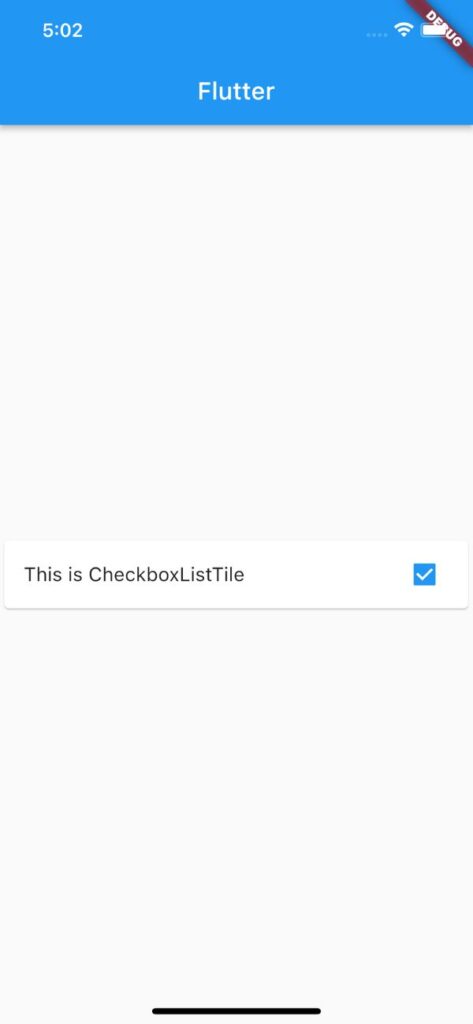
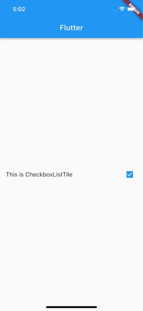
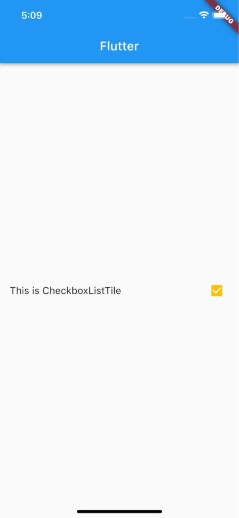
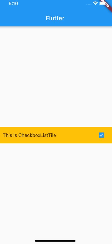
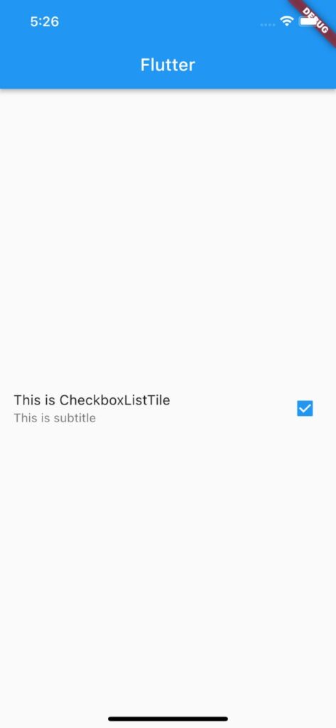
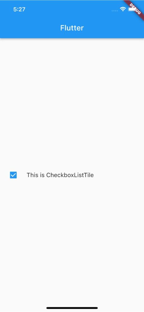
【Flutter】CheckboxListTileの使い方|ラベル付きチェックボックスを実装 2023 7/21 2023年7月20日2023年7月21日 FlutterのCheckboxListTileウィジェットの用途と使い方のまとめ記事です。本記事ではCheckboxListTileのサンプルコードを使いながら基本的な使い方、知っておきたい基本プロパティを解説していきます。 目次CheckboxListTileとは? CheckboxListTileとはCheckBoxとListTileの機能を組み合わせたウィジェットです。 </noscript><iframe data-src="https://dartpad.dev/embed-flutter.html?id=4c34e9a657356ccd870adab392621118" width="100%" height="500" class="lazyload" > CheckboxListTileの基本的な使い方 CheckboxListTileの基本形は下のサンプルコードをご覧ください。titleでチェックボックスの横に表示されるコンテンツを指定します。valueの引数にbool値として定義した変数を渡し、onChangedで変数の値を変化させます。 var _isChecked = false; CheckboxListTile( title: Text('This is CheckboxListTile'), value: _isChecked, onChanged: (newValue) { setState(() { _isChecked = newValue!; }); }, ), CheckboxListTileに影をつけて立体にする CheckboxListTileに影をつけて立体にするにはCardウィジェットを使用します。 Card( child: CheckboxListTile( title: Text('This is CheckboxListTile'), value: _isChecked, onChanged: (newValue) { setState(() { _isChecked = newValue!; }); }, ), ) アウトプット(左側) 変更後 変更前 CheckBoxで知っておきたい基本プロパティ スクロールできます プロパティ名説明activeColorチェックボックスがONの場合の背景色を指定checkColorチェックマークの色を指定tileColorタイルの背景色を指定subtitleサブコンテンツを表示controlAffinityチェックボックスを左側に表示 activeColor:ボックスがONの場合の背景色を指定 activeColorの引数にColorを渡してチェックボックス背景色を指定できます。 CheckboxListTile( title: Text('This is CheckboxListTile'), activeColor: Colors.amber, value: _isChecked, onChanged: (newValue) { setState(() { _isChecked = newValue!; }); }, ) アウトプット(左側) 変更後 変更前 checkColor:チェックマークの色を指定 checkColorの引数にColorを渡してチェックマークの色を指定できます。 CheckboxListTile( title: Text('This is CheckboxListTile'), checkColor: Colors.amber, value: _isChecked, onChanged: (newValue) { setState(() { _isChecked = newValue!; }); }, ) tileColor:タイルの背景色を指定 tileColorの引数にColorを渡してタイルの背景色を指定できます。 CheckboxListTile( title: Text('This is CheckboxListTile'), tileColor: Colors.amber, value: _isChecked, onChanged: (newValue) { setState(() { _isChecked = newValue!; }); }, ) アウトプット(左側) 変更後 変更前 subtitle:サブコンテンツを表示する subtitleの引数に任意のウィジェットを渡してサブコンテンツを表示できます。 CheckboxListTile( title: Text('This is CheckboxListTile'), subtitle: Text('This is subtitle'), value: _isChecked, onChanged: (newValue) { setState(() { _isChecked = newValue!; }); }, ) アウトプット(左側) 変更後 変更前 controlAffinity:チェックボックスを左側に表示する controlAffinityの引数にListTileControlAffinity.leadingを渡すことでチェックボックスを左側に表示できます。 CheckboxListTile( title: Text('This is CheckboxListTile'), controlAffinity: ListTileControlAffinity.leading, value: _isChecked, onChanged: (newValue) { setState(() { _isChecked = newValue!; }); }, ), アウトプット(左側) 変更後 変更前 サンプルコード import 'package:flutter/material.dart'; void main() => runApp(const MyApp()); class MyApp extends StatelessWidget { const MyApp({super.key}); @override Widget build(BuildContext context) { return MaterialApp( home: Scaffold( appBar: AppBar(title: Text('Flutter')), body: const CheckboxListTileExample(), ), ); } } class CheckboxListTileExample extends StatefulWidget { const CheckboxListTileExample({super.key}); @override State<CheckboxListTileExample> createState() => _CheckboxListTileExampleState(); } class _CheckboxListTileExampleState extends State<CheckboxListTileExample> { var _isChecked = false; @override Widget build(BuildContext context) { return Center( child: CheckboxListTile( title: Text('This is CheckboxListTile'), subtitle: Text('This is subtitle'), activeColor: Colors.amber, controlAffinity: ListTileControlAffinity.leading, value: _isChecked, onChanged: (newValue) { setState(() { _isChecked = newValue!; }); }, ), ); } } 合わせて読みたい あわせて読みたい 【Flutter】CheckBoxの使い方|チェックボックスを実装 FlutterのCheckBoxウィジェットの用途と使い方のまとめ記事です。本記事ではCheckBoxのサンプルコードを使いながら基本的な使い方、知っておきたい基本プロパティを解説… あわせて読みたい 【Flutter】CheckBoxをサイズを大きく調整する FlutterのCheckBoxのサイズを大きく(小さく)調整する方法を紹介します。CheckBoxの基本的な使い方、知っておきたい基本プロパティのまとめ記事はこちら↓ CheckBoxのサイ… あわせて読みたい 【Flutter】Radioの使い方|ラジオボタン(オプションボタン)を実装 FlutterのRadioウィジェットの用途と使い方のまとめ記事です。本記事ではRadioのサンプルコードを使いながら基本的な使い方、知っておきたい基本プロパティを解説してい… 参考サイト https://api.flutter.dev/flutter/material/CheckboxListTile-class.html プログラミング Flutter Widget

