
マテリアルボタン(ElevatedButton, OutlinedButton, TextButton)にボーダーを表示する方法を紹介します。
今回は「ElevatedButton」で解説していきますが、他のマテリアルボタンも同様です。
目次
マテリアルボタンにボーダーを表示する方法
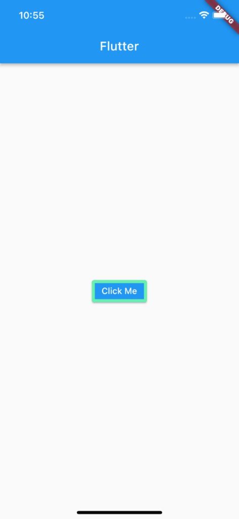
ボーダーは「style」>「ElevatedButton.styleFrom」>「side」>「BorderSide」で実装できます。
「BorderSide」の「color」でボーダー色、「width」でボーダーの幅を指定できます。
ElevatedButton(
  child: Text('Click Me'),
  style: ElevatedButton.styleFrom(
    side: BorderSide(
      color: Colors.greenAccent,
      width: 5,
    ),
  ),
  onPressed: () {},
),
サンプルコード
import 'package:flutter/material.dart';

void main() => runApp(MyApp());

class MyApp extends StatelessWidget {
  const MyApp({super.key});

  @override
  Widget build(BuildContext context) {
    return MaterialApp(
      home: Scaffold(
        appBar: AppBar(title: Text('Flutter')),
        body: Center(
          child: ElevatedButton(
            child: Text('Click Me'),
            style: ElevatedButton.styleFrom(
              side: BorderSide(
                color: Colors.greenAccent,
                width: 5,
              ),
            ),
            onPressed: () {},
          ),
        ),
      ),
    );
  }
}
以上です。
合わせて読みたい
あわせて読みたい


【Flutter】IconButtonの使い方|アイコン型ボタンを実装
Flutterのウィジェット「IconButton」の使い方を紹介します。 「IconButton」ではアイコン型ボタンを実装できます。 IconButtonの使い方 「IconButton」の「icon」で表…
あわせて読みたい
【Flutter】ElevatedButtonの非活性(disabled)色を変更
マテリアルボタン(ElevatedButton, OutlinedButton, TextButton)が非活性されているときの色を変更する方法を紹介します。 今回は「ElevatedButton」で解説していきま…