
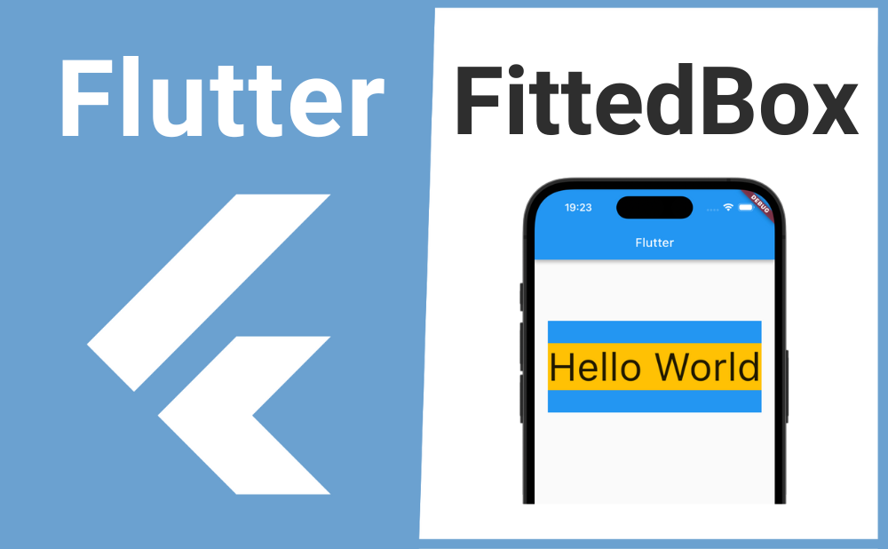
「親ウィジェットに合わせて子ウィジェットのサイズをスケーリングしたい」
こんな時に便利なのが FittedBox ウィジェットです。
FittedBoxを使用することで親ウィジェットのサイズに合わせて子ウィジェットを様々なサイズにスケーリングできます。
それではFittedBoxの基本的な使い方とカスタマイズ方法について解説していきます!
目次
基本的な使い方
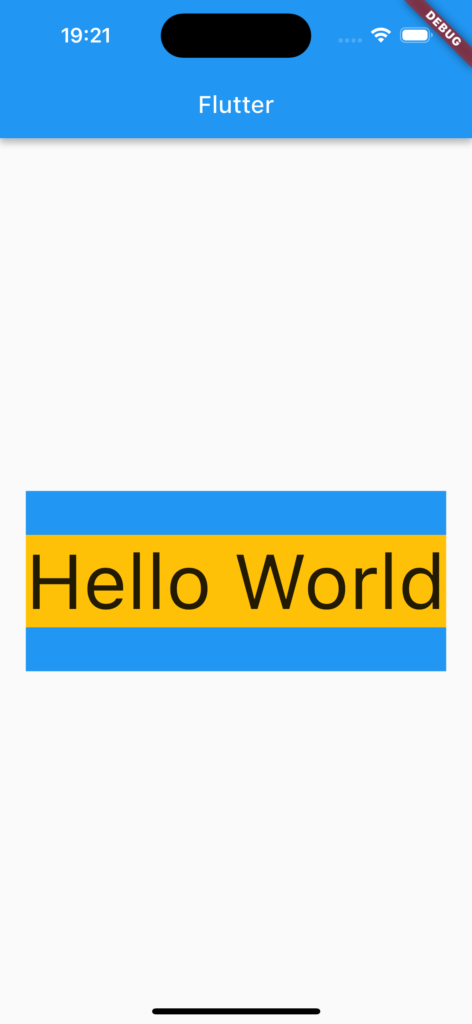
FittedBoxの基本的な使い方について解説します。
FittedBoxのchildプロパティにサイズをスケーリングしたいウィジェットを渡し、fitプロパティの引数にBoxFitウィジェットの列挙型(enum)を渡すことで次のような様々なサイズを指定できます。
| 列挙型 | 意味 |
|---|---|
| BoxFit.fill | 子ウィジェットの縦横比を歪めてでも、親ウィジェットいっぱいに広げる |
| BoxFit.contain | 子ウィジェットの縦横比を維持したまま、親ウィジェット内に収まるサイズまで広げる |
| BoxFit.cover | 子ウィジェットの縦横比を維持したまま、親ウィジェット全体を全てカバーするサイズまで広げる |
| BoxFit.fitWidth | 子ウィジェットの縦横比を維持したまま、親ウィジェットの横幅いっぱいまで広げる |
| BoxFit.fitHeight | 子ウィジェットの縦横比を維持したまま、親ウィジェットの高さいっぱいまで広げる |
| BoxFit.scaleDown | 子ウィジェットの縦横比を維持したまま、親ウィジェット内に収まるまでサイズを小さくする |
| BoxFit.none | 子ウィジェットの元のサイズで親ウィジェットに表示する |
FittedBox(
  child: MyWidget(),
  fit: BoxFit.contain,
),
画像のサンプルコード
import 'package:flutter/material.dart';

void main() => runApp(const MyApp());

class MyApp extends StatelessWidget {
  const MyApp({super.key});

  @override
  Widget build(BuildContext context) {
    return const MaterialApp(
      home: MyWidget(),
    );
  }
}

class MyWidget extends StatefulWidget {
  const MyWidget({super.key});

  @override
  State<MyWidget> createState() => _MyWidgetState();
}

class _MyWidgetState extends State<MyWidget> {
  @override
  Widget build(BuildContext context) {
    return Scaffold(
      appBar: AppBar(title: const Text('Flutter')),
      body: Center(
        child: Container(
          color: Colors.blue,
          height: 150,
          width: 350,
          child: FittedBox(
            fit: BoxFit.contain,
            child: Container(
              color: Colors.amber,
              child: Text(
                "Hello World",
                style: TextStyle(
                  fontSize: 50,
                ),
              ),
            ),
          ),
        ),
      ),
    );
  }
}
カスタマイズ方法
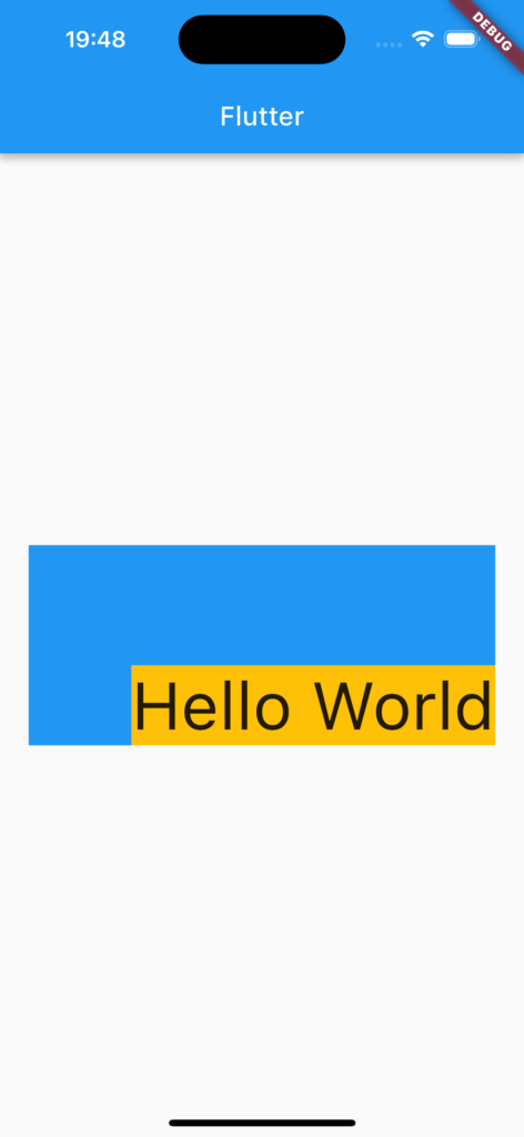
続いてFittedBoxのカスタマイズ方法について解説します。
子ウィジェットの位置
FittedBoxの子ウィジェットの位置をalignmentプロパティで設定できます。
FittedBoxプロパティの引数にAlignmentウィジェットの列挙型(enum)またはコンストラクタ渡すことで次のような様々な配置を指定できます。
| 位置 | 列挙型 | コンストラクタ |
|---|---|---|
| 左上 | Alignment.topLeft | Alignment(-1.0, -1.0) |
| 中央上 | Alignment.topCenter | Alignment(0.0, -1.0) |
| 右上 | Alignment.topRight | Alignment(1.0, -1.0) |
| 中央左 | Alignment.centerLeft | Alignment(-1.0, 0.0) |
| 中央 | Alignment.center | Alignment(0.0, 0.0) |
| 中央右 | Alignment.centerRight | Alignment(1.0, 0.0) |
| 左下 | Alignment.bottomLeft | Alignment(-1.0, 1.0) |
| 中央下 | Alignment.bottomCenter | Alignment(0.0, 1.0) |
| 右下 | Alignment.bottomRight | Alignment(1.0, 1.0) |
FittedBox(
  fit: BoxFit.scaleDown,
  alignment: Alignment.bottomRight,
  child: MyWidget(),
),
画像のサンプルコード
import 'package:flutter/material.dart';

void main() => runApp(const MyApp());

class MyApp extends StatelessWidget {
  const MyApp({super.key});

  @override
  Widget build(BuildContext context) {
    return const MaterialApp(
      home: MyWidget(),
    );
  }
}

class MyWidget extends StatefulWidget {
  const MyWidget({super.key});

  @override
  State<MyWidget> createState() => _MyWidgetState();
}

class _MyWidgetState extends State<MyWidget> {
  @override
  Widget build(BuildContext context) {
    return Scaffold(
      appBar: AppBar(title: const Text('Flutter')),
      body: Center(
        child: Container(
          color: Colors.blue,
          height: 150,
          width: 350,
          child: FittedBox(
            fit: BoxFit.scaleDown,
            alignment: Alignment.bottomRight,
            child: Container(
              color: Colors.amber,
              child: Text(
                "Hello World",
                style: TextStyle(
                  fontSize: 50,
                ),
              ),
            ),
          ),
        ),
      ),
    );
  }
}
まとめ
今回はFittedBoxの基本的な使い方とカスタマイズ方法について解説しました。
FittedBoxを使用することで親ウィジェットのサイズに合わせて子ウィジェットを様々なサイズにスケーリングできるのでぜひ使ってみてください。