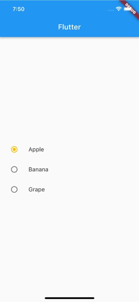
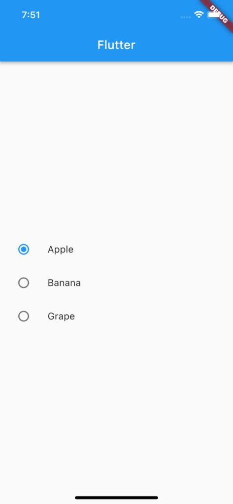
【Flutter】Radioの使い方|ラジオボタン(オプションボタン)を実装 2023 7/21 2023年7月20日2023年7月21日 FlutterのRadioウィジェットの用途と使い方のまとめ記事です。本記事ではRadioのサンプルコードを使いながら基本的な使い方、知っておきたい基本プロパティを解説していきます。 目次Radioとは? Radioとはラジオボタン(オプションボタン)を実装できるウィジェットです。 </noscript><iframe data-src="https://dartpad.dev/embed-flutter.html?id=9d0d0083a0fb1f34a37eec2c152167a0" width="100%" height="500" class="lazyload" > Radioの基本的な使い方 Radioの基本形は下のサンプルコードをご覧ください。ラジオボタンのオプションの数だけRadioを作成し、それぞれのgroupValueに同名の変数を渡すことで同一のグループとして扱います。 valueには各ラジオボタンの固有となる値を渡し、onChangedでgroupValueの値を更新(下のサンプルコード参照)します。 enum FruitList { apple, banana, grape } FruitList _fruit = FruitList.apple; Column( mainAxisAlignment: MainAxisAlignment.center, children: [ ListTile( title: Text('Apple'), leading: Radio( value: FruitList.apple, groupValue: _fruit, onChanged: (value) { setState(() { _fruit = value!; }); }, ), ), ListTile( title: Text('Banana'), leading: Radio( value: FruitList.banana, groupValue: _fruit, onChanged: (value) { setState(() { _fruit = value!; }); }, ), ), ListTile( title: Text('Grape'), leading: Radio( value: FruitList.grape, groupValue: _fruit, onChanged: (value) { setState(() { _fruit = value!; }); }, ), ) ], ) Radioで知っておきたい基本プロパティ スクロールできます プロパティ名説明activeColorラジオボタンが選択されている場合の背景色を指定 activeColor:ラジオボタンが選択されている場合の背景色を指定 activeColorの引数にColorを渡してラジオボタンの背景色を指定できます。 Radio( activeColor: Colors.amber, value: FruitList.apple, groupValue: _fruit, onChanged: (value) { setState(() { _fruit = value!; }); }, ), アウトプット(左側) 変更後 変更前 サンプルコード import 'package:flutter/material.dart'; void main() => runApp(const MyApp()); class MyApp extends StatelessWidget { const MyApp({super.key}); @override Widget build(BuildContext context) { return MaterialApp( home: Scaffold( appBar: AppBar(title: Text('Flutter')), body: const RadioExample(), ), ); } } enum FruitList { apple, banana, grape } class RadioExample extends StatefulWidget { const RadioExample({super.key}); @override State<RadioExample> createState() => _RadioExampleState(); } class _RadioExampleState extends State<RadioExample> { FruitList _fruit = FruitList.apple; @override Widget build(BuildContext context) { return Column( mainAxisAlignment: MainAxisAlignment.center, children: [ ListTile( title: Text('Apple'), leading: Radio( value: FruitList.apple, groupValue: _fruit, onChanged: (value) { setState(() { _fruit = value!; }); }, ), ), ListTile( title: Text('Banana'), leading: Radio( value: FruitList.banana, groupValue: _fruit, onChanged: (value) { setState(() { _fruit = value!; }); }, ), ), ListTile( title: Text('Grape'), leading: Radio( value: FruitList.grape, groupValue: _fruit, onChanged: (value) { setState(() { _fruit = value!; }); }, ), ) ], ); } } 合わせて読みたい あわせて読みたい 【Flutter】CheckBoxの使い方|チェックボックスを実装 FlutterのCheckBoxウィジェットの用途と使い方のまとめ記事です。本記事ではCheckBoxのサンプルコードを使いながら基本的な使い方、知っておきたい基本プロパティを解説… あわせて読みたい 【Flutter】CheckboxListTileの使い方|ラベル付きチェックボックスを実装 FlutterのCheckboxListTileウィジェットの用途と使い方のまとめ記事です。本記事ではCheckboxListTileのサンプルコードを使いながら基本的な使い方、知っておきたい基本… 参考サイト https://api.flutter.dev/flutter/material/Radio-class.html プログラミング Flutter Widget