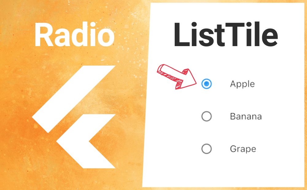
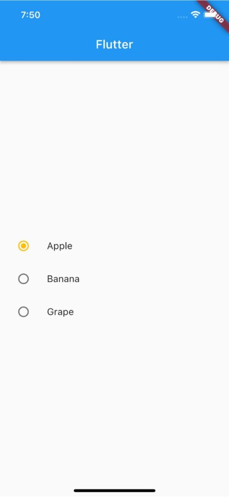
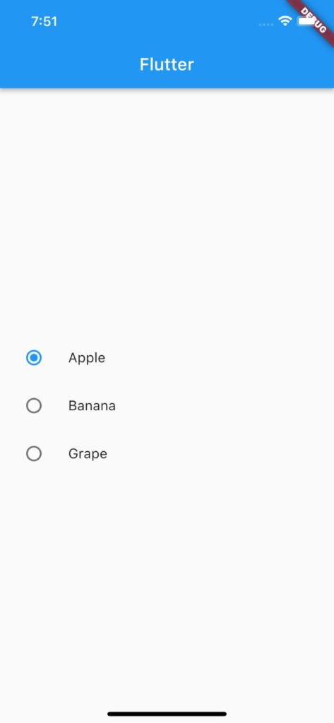
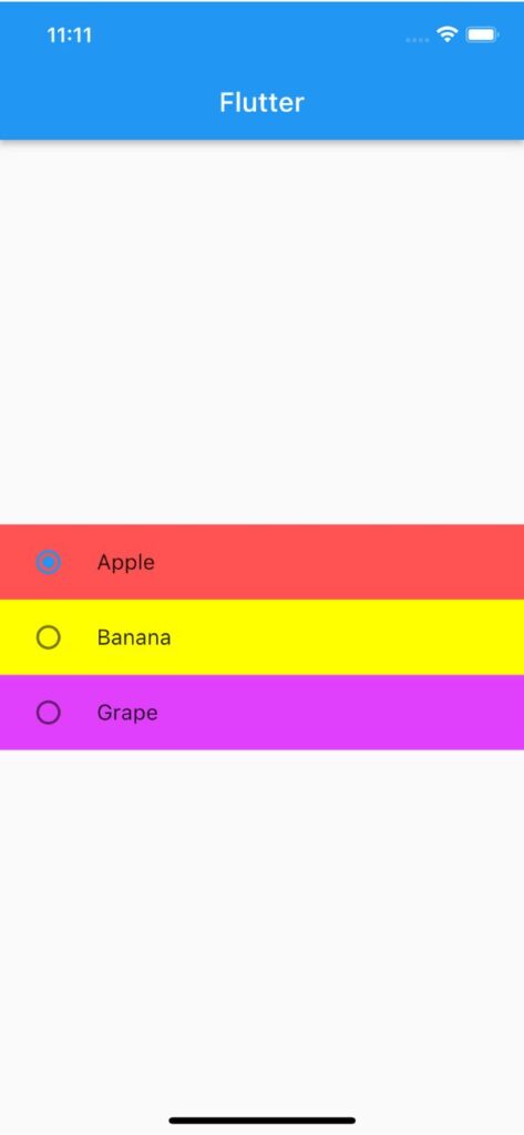
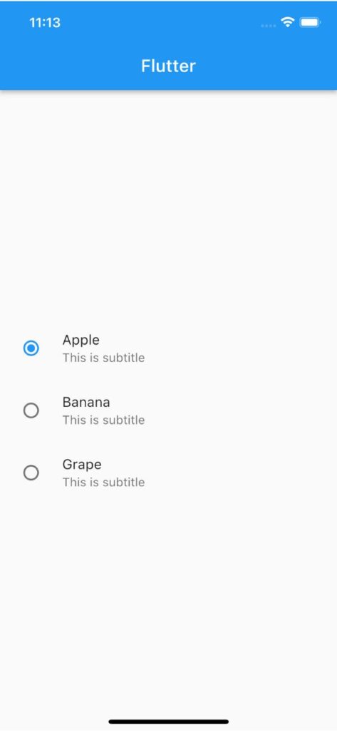
【Flutter】RadioListTileの使い方|ラベル付きラジオボタンを実装 2023 10/03 2023年7月21日2023年10月3日 FlutterのRadioListTileウィジェットの用途と使い方のまとめ記事です。本記事ではRadioListTileのサンプルコードを使いながら基本的な使い方、知っておきたい基本プロパティを解説していきます。 目次RadioListTileとは? RadioListTileとはRadioとListTileの機能を組み合わせたウィジェットです。 </noscript><iframe data-src="https://dartpad.dev/embed-flutter.html?id=2580e74153f62440960bacd90e8835a1" width="100%" height="500" class="lazyload" > RadioListTileの基本的な使い方 RadioListTileの基本形は下のサンプルコードをご覧ください。titleでラジオボタンの横に表示されるコンテンツを指定します。value、groupValue、onChangedはRadioと同様に扱います。 あわせて読みたい 【Flutter】Radioの使い方|ラジオボタン(オプションボタン)を実装 FlutterのRadioウィジェットの用途と使い方のまとめ記事です。本記事ではRadioのサンプルコードを使いながら基本的な使い方、知っておきたい基本プロパティを解説してい… enum FruitList { apple, banana, grape } FruitList _fruit = FruitList.apple; RadioListTile( title: const Text('Apple'), value: FruitList.apple, groupValue: _fruit, onChanged: (value) { setState(() { _fruit = value!; }); }, ) RadioListTileで知っておきたい基本プロパティ スクロールできます プロパティ名説明activeColorラジオボタンが選択されている場合の背景色を指定tileColorタイルの背景色を指定subtitleサブコンテンツを表示 activeColor:ラジオボタンが選択されている場合の背景色を指定 activeColorの引数にColorを渡してラジオボタンが選択されている場合の背景色を指定できます。 CheckboxListTile( title: Text('This is CheckboxListTile'), activeColor: Colors.amber, value: _isChecked, onChanged: (newValue) { setState(() { _isChecked = newValue!; }); }, ) アウトプット(左側) 変更後 変更前 tileColor:タイルの背景色を指定 tileColorの引数にColorを渡してタイルの背景色を指定できます。 RadioListTile( title: const Text('Apple'), value: FruitList.apple, groupValue: _fruit, tileColor: Colors.amber, onChanged: (value) { setState(() { _fruit = value!; }); }, ) アウトプット(左側) 変更後 変更前 subtitle:サブコンテンツを表示する subtitleの引数に任意のウィジェットを渡してサブコンテンツを表示できます。 RadioListTile( title: const Text('Apple'), subtitle: Text('This is subtitle'), value: FruitList.apple, groupValue: _fruit, onChanged: (value) { setState(() { _fruit = value!; }); }, ) アウトプット(左側) 変更後 変更前 サンプルコード import 'package:flutter/material.dart'; void main() => runApp(const MyApp()); class MyApp extends StatelessWidget { const MyApp({super.key}); @override Widget build(BuildContext context) { return MaterialApp( home: Scaffold( appBar: AppBar(title: Text('Flutter')), body: const CheckboxListTileExample(), ), ); } } class CheckboxListTileExample extends StatefulWidget { const CheckboxListTileExample({super.key}); @override State<CheckboxListTileExample> createState() => _CheckboxListTileExampleState(); } class _CheckboxListTileExampleState extends State<CheckboxListTileExample> { var _isChecked = false; @override Widget build(BuildContext context) { return Center( child: CheckboxListTile( title: Text('This is CheckboxListTile'), subtitle: Text('This is subtitle'), activeColor: Colors.amber, controlAffinity: ListTileControlAffinity.leading, value: _isChecked, onChanged: (newValue) { setState(() { _isChecked = newValue!; }); }, ), ); } } 合わせて読みたい あわせて読みたい 【Flutter】CheckBoxの使い方|チェックボックスを実装 FlutterのCheckBoxウィジェットの用途と使い方のまとめ記事です。本記事ではCheckBoxのサンプルコードを使いながら基本的な使い方、知っておきたい基本プロパティを解説… あわせて読みたい 【Flutter】CheckboxListTileの使い方|ラベル付きチェックボックスを実装 FlutterのCheckboxListTileウィジェットの用途と使い方のまとめ記事です。本記事ではCheckboxListTileのサンプルコードを使いながら基本的な使い方、知っておきたい基本… あわせて読みたい 【Flutter】Radioの使い方|ラジオボタン(オプションボタン)を実装 FlutterのRadioウィジェットの用途と使い方のまとめ記事です。本記事ではRadioのサンプルコードを使いながら基本的な使い方、知っておきたい基本プロパティを解説してい… 参考サイト https://api.flutter.dev/flutter/material/RadioListTile-class.html プログラミング Flutter Widget