
Flutterのウィジェット「Tooltip」の使い方を紹介します。
「Tooltip」では任意のウィジェットを長押ししてツールチップ(ツールヒント)を表示させることができます。
目次
Tooltipの使い方
「TextButton」の基本的な使い方は下記コードの通りです。
「child」でボタン上に表示されるウィジェットを指定し、「onPressed」でボタンがクリックされた時の処理を書きます。
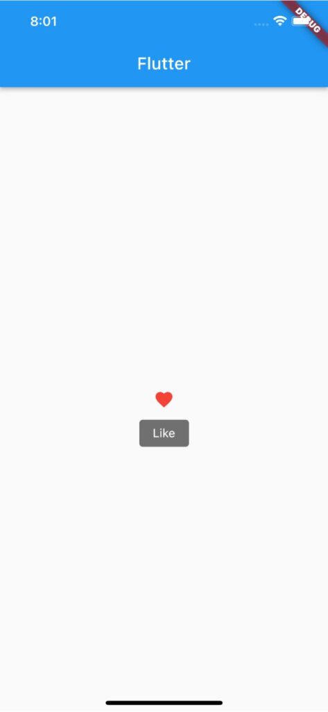
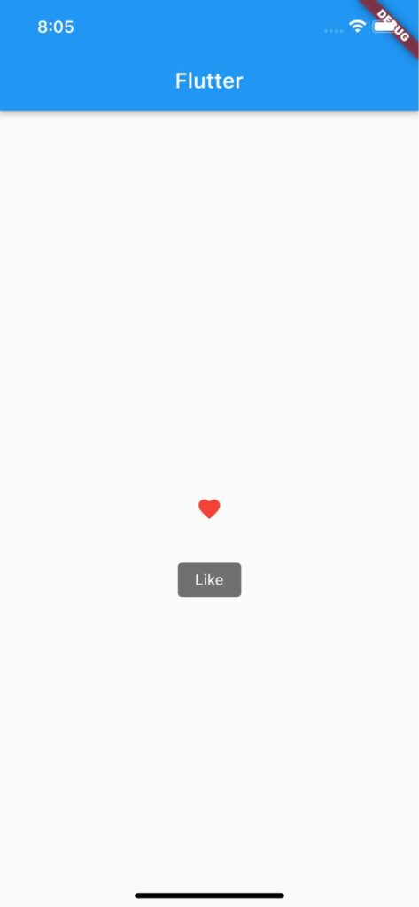
Tooltip(
message: 'Like',
child: Icon(
Icons.favorite,
color: Colors.red,
),
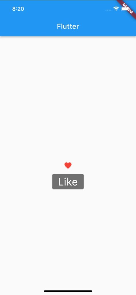
),ツールチップの高さを変更する
ツールチップの高さを変更するには「height」を使用します。
Tooltip(
message: 'Like',
height: 50,
child: Icon(
Icons.favorite,
color: Colors.red,
),
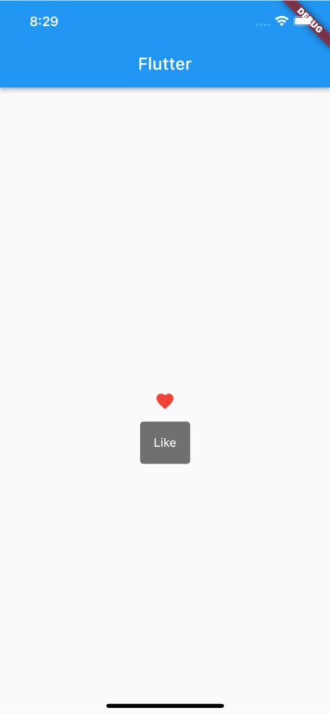
),ツールチップの表示位置を上にする
ツールチップの表示を上側にするには「preferBelow」を「false」にします。
Tooltip(
  message: 'Like',
  preferBelow: false,
  child: Icon(
    Icons.favorite,
    color: Colors.red,
  ),
),
ツールチップの表示位置を調整する
ツールチップの表示位置を調整するには「verticalOffset」を使用します。
先ほど紹介した「preferBelow」が「true」の場合は正数を渡すと下側、負数の場合は上側にツールチップを移動できます。
Tooltip(
  message: 'Like',
  verticalOffset: 50,
  child: Icon(
    Icons.favorite,
    color: Colors.red,
  ),
),
ツールチップの表示時間を変更する
ツールチップの表示時間を変更するには「showDuration」を使用します。
「showDuration」には「Duration」を渡して表示時間を指定できます。
Tooltip(
  message: 'Like',
  showDuration: Duration(seconds: 3),
  child: Icon(
    Icons.favorite,
    color: Colors.red,
  ),
),
ツールチップの表示文字を装飾する
ツールチップの表示文字を装飾するには「textStyle」を使用できます。
Tooltip(
  message: 'Like',
  textStyle: TextStyle(
    fontSize: 30,
    color: Colors.white,
  ),
  child: Icon(
    Icons.favorite,
    color: Colors.red,
  ),
),
ツールチップの背景色を変更する
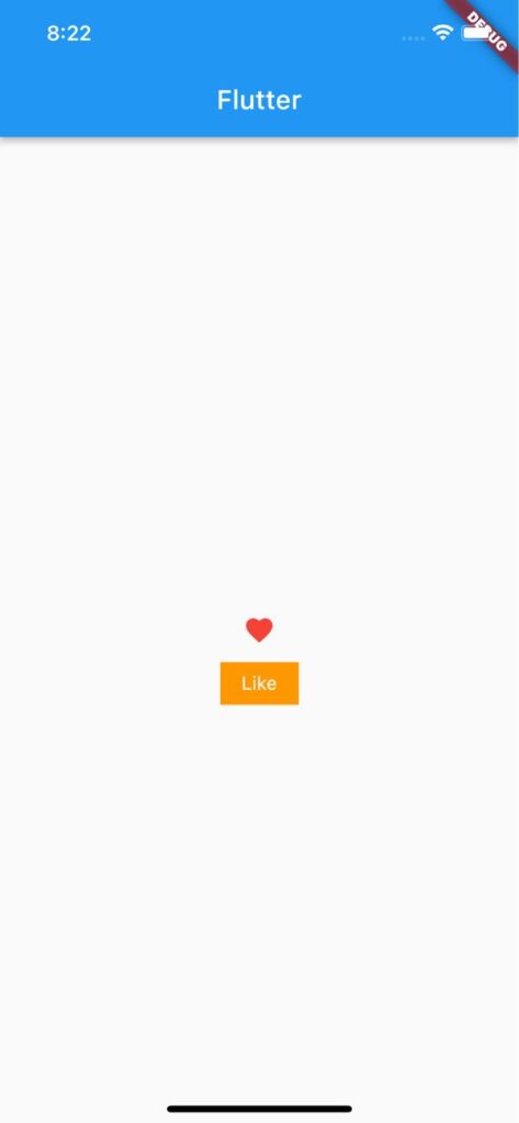
ツールチップの背景色を変更するには「decoration」>「BoxDecoration」の「color」で指定できます。
Tooltip(
  message: 'Like',
  decoration: BoxDecoration(color: Colors.orange),
  child: Icon(
    Icons.favorite,
    color: Colors.red,
  ),
),
以上です。
合わせて読みたい
あわせて読みたい

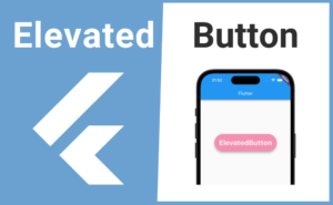
【Flutter】ElevatedButtonの使い方|立体的なボタンを表示・装飾する
ElevatedButtonウィジェットの基本的な使い方について解説します。ElevatedButtonを使用することで影のある立体的なボタンを実装できます。またElevatedButton.styleFromウィジェットを使えばボタンの背景色や形、影の高さなど様々な装飾ができます。
あわせて読みたい

【Flutter】OutlinedButtonの使い方|立体ボタンを実装
Flutterのウィジェット「OutlinedButton」の使い方を紹介します。 「OutlinedButton」ではマテリアルデザインによる立体的なボタンを実装できます。 OutlinedButtonの基…
あわせて読みたい
【Flutter】IconButtonの使い方|アイコン型ボタンを実装
Flutterのウィジェット「IconButton」の使い方を紹介します。 「IconButton」ではアイコン型ボタンを実装できます。 IconButtonの使い方 「IconButton」の「icon」で表…