
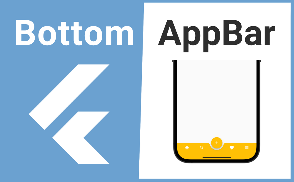
「Flutterアプリの画面下にナビゲーションメニューを表示したい」
こんな時に便利なのが BottomAppBar ウィジェットです。
BottomAppBarを使用することでアプリの画面下部にナビゲーションメニューを実装できます。またFloatingActionButtonをU字状にめり込ませて表示することもできます。
それではBottomAppBarの基本的な使い方とカスタマイズ方法について解説していきます!
基本的な使い方
BottomAppBarの基本的な使い方について解説します。
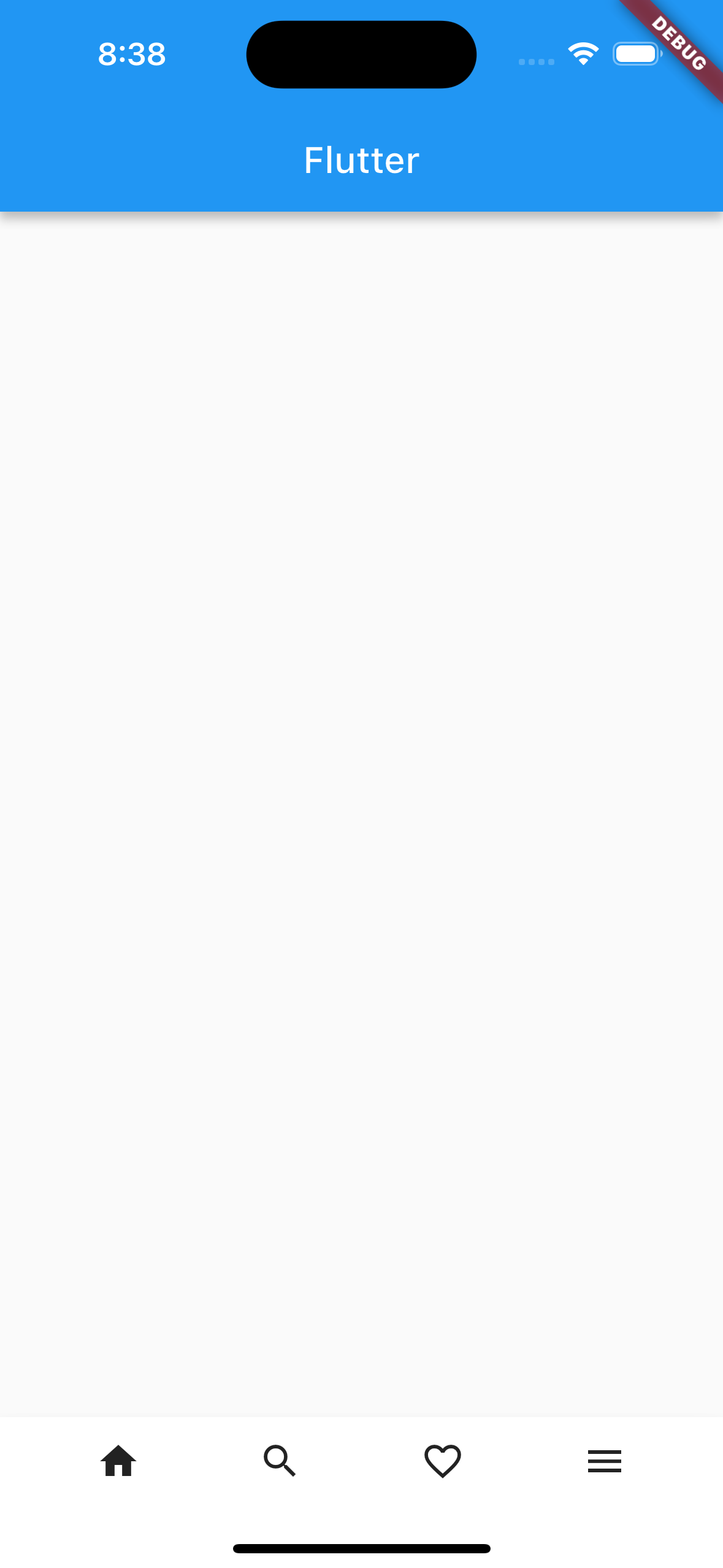
BottomAppBarはScaffoldのbottomNavigationBarプロパティの引数として使用されます。またBottomAppBarのchildプロパティの引数にRowを渡すことで複数のウィジェットを並べられます。
Scaffold(
  bottomNavigationBar: BottomAppBar(
    child: Row(
      children: [
        WidgetA(),
        WidgetB(),
        WidgetC(),
      ],
    ),
  ),
);
画像のサンプルコード
import 'package:flutter/material.dart';

void main() => runApp(const MyApp());

class MyApp extends StatelessWidget {
  const MyApp({super.key});

  @override
  Widget build(BuildContext context) {
    return const MaterialApp(
      home: MyWidget(),
    );
  }
}

class MyWidget extends StatelessWidget {
  const MyWidget({super.key});

  @override
  Widget build(BuildContext context) {
    return Scaffold(
      appBar: AppBar(title: const Text('Flutter')),
      bottomNavigationBar: BottomAppBar(
        child: Row(
          mainAxisAlignment: MainAxisAlignment.spaceEvenly,
          children: [
            IconButton(
              icon: const Icon(Icons.home),
              onPressed: () {},
            ),
            IconButton(
              icon: const Icon(Icons.search),
              onPressed: () {},
            ),
            IconButton(
              icon: const Icon(Icons.favorite_border),
              onPressed: () {},
            ),
            IconButton(
              icon: const Icon(Icons.menu),
              onPressed: () {},
            ),
          ],
        ),
      ),
    );
  }
}
カスタマイズ方法
続いてBottomAppBarのカスタマイズ方法について解説します。
背景色
BottomAppBarの背景色はcolorプロパティで設定できます。
BottomAppBar(
  color: Colors.pink[100],
),
高さ
BottomAppBarの高さはheightプロパティで設定できます。
BottomAppBar(
height: 30,
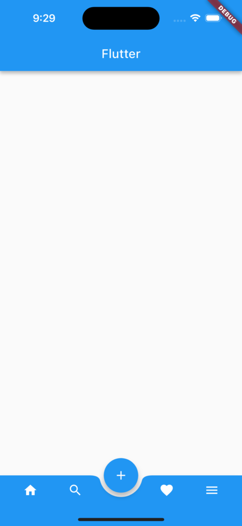
),FABをBottomAppBarにU字状にめり込ませる
BottomAppBarにFloatingActionButton(FAB)をU字状にめり込ませて表示する方法を解説します。
まずはScaffoldのfloatingActionButtonLocationプロパティの引数にFloatingActionButtonLocationウィジェットの列挙型(enum)を渡してFABの位置とめり込む深さを設定します。
| 列挙型 | 配置 |
|---|---|
| FloatingActionButtonLocation.centerDocked | 中央でめり込む |
| FloatingActionButtonLocation.miniCenterDocked | 中央で少しめり込む |
| FloatingActionButtonLocation.endDocked | 右側でめり込む |
| FloatingActionButtonLocation.miniEndDocked | 右側で少しめり込む |
| FloatingActionButtonLocation.endContained | 右側で深くめり込む |
次にBottomAppBarのshapeプロパティにCircularNotchedRectangleウィジェットを渡し、notchMarginプロパティでFABとBottomAppBar間の余白を設定します。
Scaffold(
  floatingActionButtonLocation: FloatingActionButtonLocation.centerDocked,
  floatingActionButton: FloatingActionButton(
    child: Icon(Icons.add),
    onPressed: () {},
  ),
  bottomNavigationBar: BottomAppBar(
    shape: CircularNotchedRectangle(),
    notchMargin: 7.0,
  ),
);
画像のサンプルコード
import 'package:flutter/material.dart';

void main() => runApp(const MyApp());

class MyApp extends StatelessWidget {
  const MyApp({super.key});

  @override
  Widget build(BuildContext context) {
    return const MaterialApp(
      home: MyWidget(),
    );
  }
}

class MyWidget extends StatelessWidget {
  const MyWidget({super.key});

  @override
  Widget build(BuildContext context) {
    return Scaffold(
      appBar: AppBar(title: const Text('Flutter')),
      floatingActionButtonLocation: FloatingActionButtonLocation.centerDocked,
      floatingActionButton: FloatingActionButton(
        child: Icon(Icons.add),
        onPressed: () {},
      ),
      bottomNavigationBar: BottomAppBar(
        shape: CircularNotchedRectangle(),
        notchMargin: 7.0,
        color: Colors.blue,
        child: Row(
          mainAxisAlignment: MainAxisAlignment.spaceEvenly,
          children: [
            IconButton(
              icon: const Icon(Icons.home),
              color: Colors.white,
              onPressed: () {},
            ),
            IconButton(
              icon: const Icon(Icons.search),
              color: Colors.white,
              onPressed: () {},
            ),
            SizedBox(width: 50),
            IconButton(
              icon: const Icon(Icons.favorite),
              color: Colors.white,
              onPressed: () {},
            ),
            IconButton(
              icon: const Icon(Icons.menu),
              color: Colors.white,
              onPressed: () {},
            ),
          ],
        ),
      ),
    );
  }
}
まとめ
今回はBottomAppBarの基本的な使い方とカスタマイズ方法について解説しました。
BottomAppBarを使用することでアプリの画面下部にナビゲーションメニューを実装できます。またFloatingActionButtonをU字状にめり込ませて表示することもできるのでぜひ使ってみてください。